
How a 9.8% Conversion Insight Led to a Smarter AI Clips Review Experience
How a 9.8% Conversion Insight Led to a Smarter AI Clips Review Experience
How a 9.8% Conversion Insight Led to a Smarter AI Clips Review Experience
Redesigning the AI Clips Review screen to drive deeper exploration and editor usage, guided by data that revealed users who edited clips converted 12x more than those who didn’t.

Context
Context
Context
quso.ai is an all-in-one AI-powered tool for creators, offering features like AI-generated clips, captions, avatars, and scheduling. Among these, AI Clips quickly became the most widely used feature, accounting for over 70% of content creation activity on the platform. This made it a high-leverage area for optimization.
How AI Clips Work?
Users upload a long-form video, and AI analyzes the content to generate short, engaging clips. These clips are optimized for social media — removing filler words, cutting silence, and generating quick, punchy edits complete with captions and transcripts. Users can review, edit, or export these clips directly.
At quso.ai, I worked as the sole product designer on the iOS app, driving the design process end-to-end—from ideation and user flows to high-fidelity designs and handoff.
On the web platform, I contributed to revamp the video editor, improving its usability and visual clarity for a smoother content creation experience. I also worked closely with product and engineering to design AI-powered features like AI Clips, focusing on integrating generative AI in a way that felt seamless and intuitive to users.
Why We Decided to Redesign the Review Screen?
Why We Decided to Redesign the Review Screen?
Why We Decided to Redesign the Review Screen?
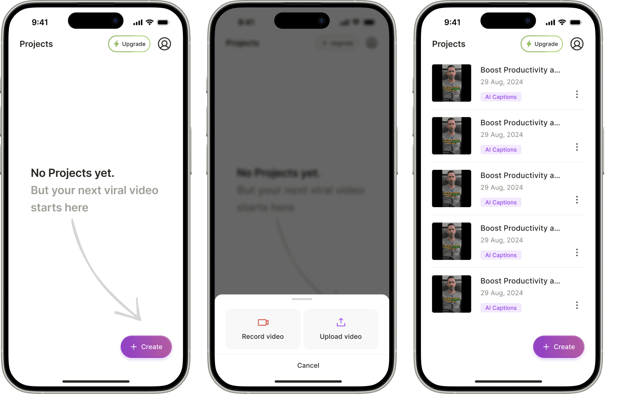
The Review screen is the interface shown to users after AI Clips are generated. It displays all the short clips created from their original video and is designed to help users quickly scan, select, and edit the most relevant clips before exporting. It’s a critical step in the user journey — ideally converting raw AI output into shareable content.
Despite its popularity, data revealed significant drop-offs and missed engagement opportunities — especially on the Review screen, which acts as the main gateway to the Editor. The data says:
The Review screen was the critical gateway to the conversion-driving feature, yet 42% of users dropped off before interacting with it.
Users who entered the Editor converted at 9.8%, compared to just 0.77% of non-editors — a 12x difference. But we observed only 26% of users on the Review screen actually reached the Editor, meaning most users never got to the most impactful part of the flow.
For those who did view the screen, most only watched the first clip, indicating the layout didn’t support effective exploration or decision-making.
At quso.ai, I worked as the sole product designer on the iOS app, driving the design process end-to-end—from ideation and user flows to high-fidelity designs and handoff.
On the web platform, I contributed to revamp the video editor, improving its usability and visual clarity for a smoother content creation experience. I also worked closely with product and engineering to design AI-powered features like AI Clips, focusing on integrating generative AI in a way that felt seamless and intuitive to users.
Design Goals
Design Goals
Design Goals
Improve clip discoverability so users can explore beyond the first clip
Increase editor engagement by making the Edit CTA intuitive and visible
Simplify the interface to support focused decisions by reducing distractions, clarifying the visual hierarchy, and aligning actions with user intent
Offer fallback control by enabling users to create custom clips if needed
At quso.ai, I worked as the sole product designer on the iOS app, driving the design process end-to-end—from ideation and user flows to high-fidelity designs and handoff.
On the web platform, I contributed to revamp the video editor, improving its usability and visual clarity for a smoother content creation experience. I also worked closely with product and engineering to design AI-powered features like AI Clips, focusing on integrating generative AI in a way that felt seamless and intuitive to users.
Design Process
Design Process
Design Process
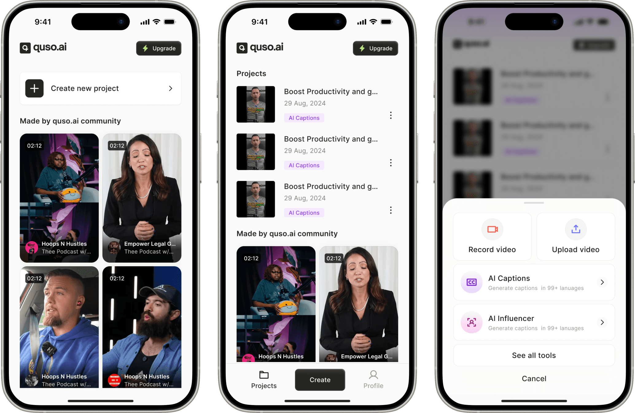
Home Screen Interation 1
Our original scope included launching all core features from quso in a single mobile app. The home screen was designed to act less like a dashboard and more like a content hub.
There wasn’t a traditional “home” screen. Instead:
A CTA button Create (placed at the top) opened a creation sheet with all three feature options for new users
Existing users would land directly on their projects
The tab bar had three sections: Projects, Create, and Profile
This exploration helped us confirm that we’d move forward with launching three features — AI Clips, Captions, and Influencers. We decided the next version should mirror the web experience, so existing users would have less guesswork and a smoother transition.
Iteration 1
Our original scope included launching all core features from quso in a single mobile app. The home screen was designed to act less like a dashboard and more like a content hub.
There wasn’t a traditional “home” screen. Instead:
A CTA button Create (placed at the top) opened a creation sheet with all three feature options for new users
Existing users would land directly on their projects
The tab bar had three sections: Projects, Create, and Profile
This exploration helped us confirm that we’d move forward with launching three features — AI Clips, Captions, and Influencers. We decided the next version should mirror the web experience, so existing users would have less guesswork and a smoother transition.
Home Screen Iteration 2
After deciding to launch three features, we shifted our focus to make the app feel more like the web platform, especially for returning users who were already familiar with its structure.
This version of the home screen leaned into consistency:
A structured layout similar to a web, with clear cards for each feature.
These cards opened a bottom sheet to choose between upload and record video options.
Tabs at the bottom changed to Home, Projects, and Profile.
The goal here was to reduce the learning curve and make cross-platform usage feel seamless.
Iteration 2
After deciding to launch three features, we shifted our focus to make the app feel more like the web platform, especially for returning users who were already familiar with its structure.
This version of the home screen leaned into consistency:
A structured layout similar to a web, with clear cards for each feature.
These cards opened a bottom sheet to choose between upload and record video options.
Tabs at the bottom changed to Home, Projects, and Profile.
The goal here was to reduce the learning curve and make cross-platform usage feel seamless.

Home Screen Iteration 3
At this stage, we made two major shifts:
We decided to launch only AI Captions and not all three features
We launched it as a separate, lowkey MVP under the name "Captions & Subtitles" — not under the quso brand
With this narrowed scope, the home screen needed to reflect the product’s new focus: fast, single-purpose caption generation.
For new users, the home screen was clean and minimal, keeping the focus on getting started quickly.
No tab bar, no navigation-heavy layout.
Floating "Create" button as the primary action.
User projects appear directly on the home screen, making reuse and re-exports easy.
Iteration 3
At this stage, we made two major shifts:
We decided to launch only AI Captions and not all three features
We launched it as a separate, lowkey MVP under the name "Captions & Subtitles" — not under the quso brand
With this narrowed scope, the home screen needed to reflect the product’s new focus: fast, single-purpose caption generation.
For new users, the home screen was clean and minimal, keeping the focus on getting started quickly.
No tab bar, no navigation-heavy layout.
Floating "Create" button as the primary action.
User projects appear directly on the home screen, making reuse and re-exports easy.
AI Captions
The entire flow was built to feel fast, focused, and mobile-first. Tapping the floating "Create" button opened a bottom sheet with two options: upload from the gallery or record directly. Once a video was selected, users landed on a preview screen with an optional language selector, a trim button, and a clear call to action: "Generate Captions". After that, a short animated loading screen bridged the wait while captions were processed in seconds. The goal was to keep everything light, smooth, and actionable, from input to output, with as little friction as possible.
Iteration 2
After deciding to launch three features, we shifted our focus to make the app feel more like the web platform, especially for returning users who were already familiar with its structure.
This version of the home screen leaned into consistency:
A structured layout similar to a web, with clear cards for each feature.
These cards opened a bottom sheet to choose between upload and record video options.
Tabs at the bottom changed to Home, Projects, and Profile.
The goal here was to reduce the learning curve and make cross-platform usage feel seamless.

Editor
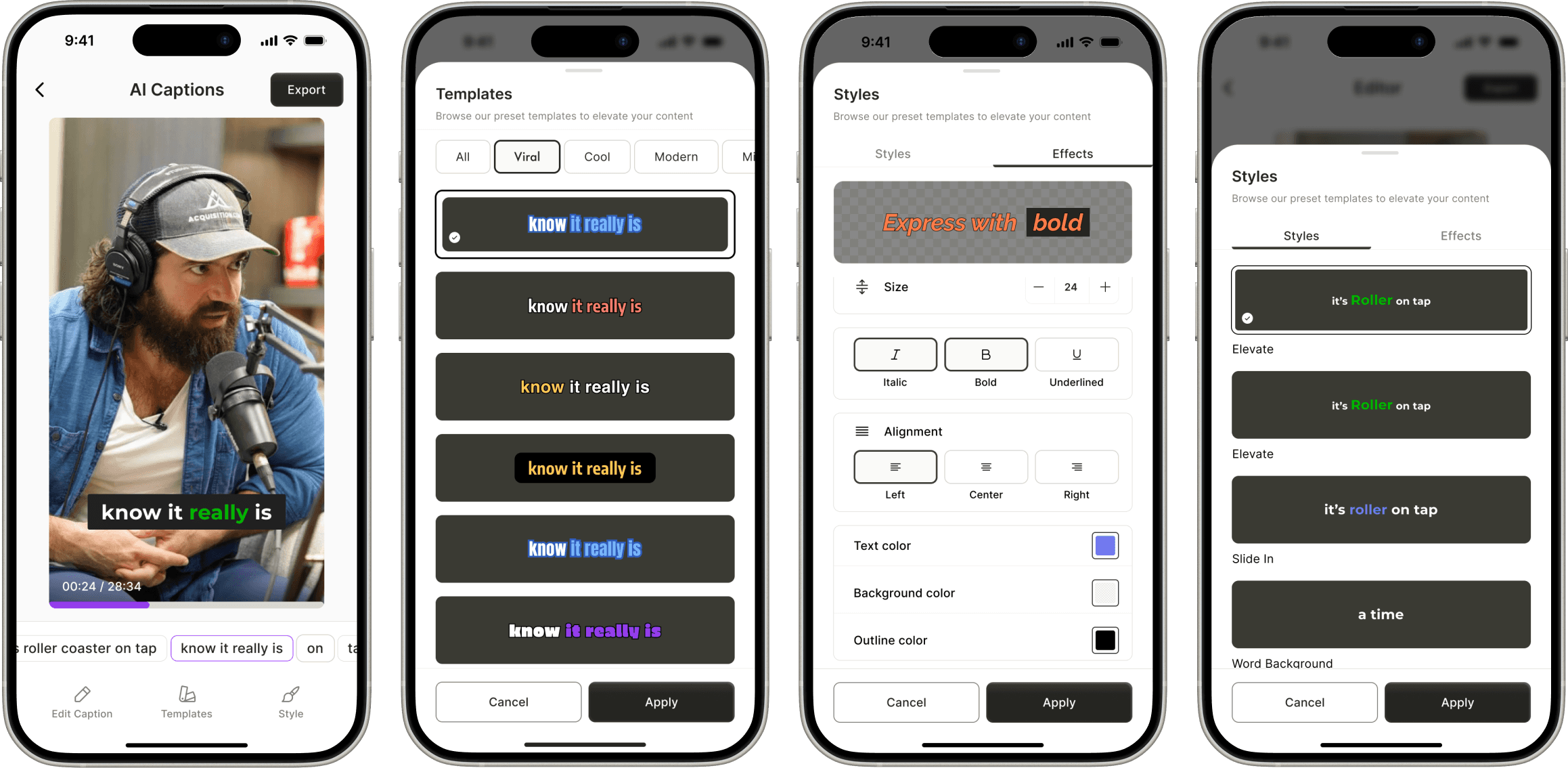
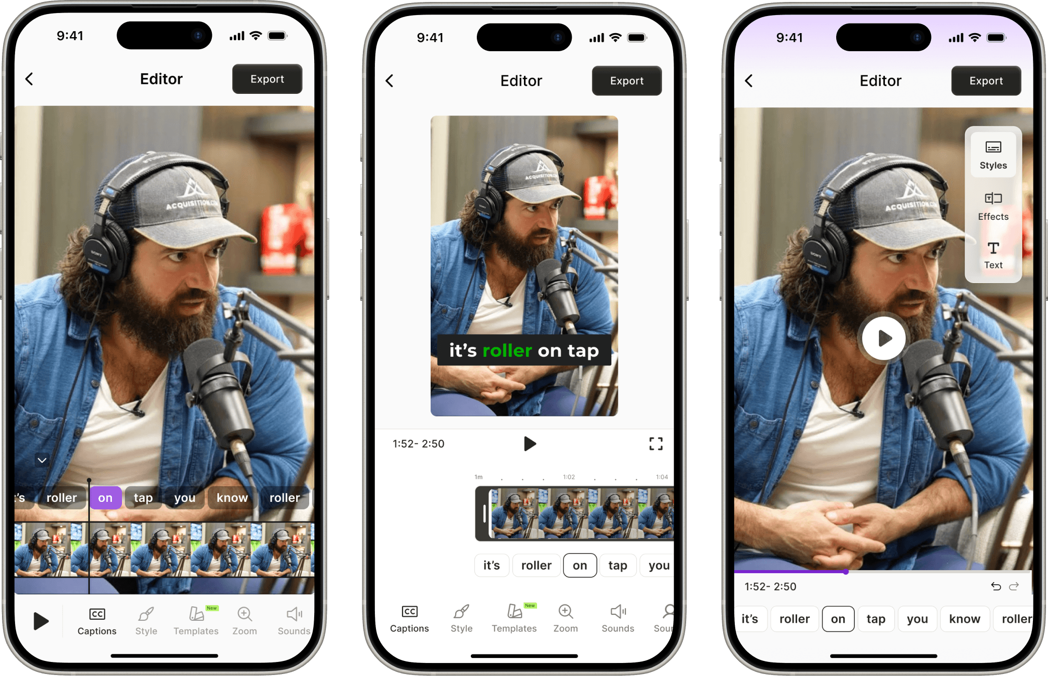
Once captions are generated, users land in an editor that’s flexible but focused. We broke down the editing tools into intuitive tabs — Edit, Templates, Styles. Creators could tweak their content without feeling buried in options.
From bold animations to subtle typography shifts, every setting was just a tap away. The goal? Let users feel in control without needing a tutorial. By keeping the interface lightweight and scroll-friendly, we turned what could’ve been a complex captioning workflow into a fun, creative playground.
Iteration 3
At this stage, we made two major shifts:
We decided to launch only AI Captions and not all three features
We launched it as a separate, lowkey MVP under the name "Captions & Subtitles" — not under the quso brand
With this narrowed scope, the home screen needed to reflect the product’s new focus: fast, single-purpose caption generation.
For new users, the home screen was clean and minimal, keeping the focus on getting started quickly.
No tab bar, no navigation-heavy layout.
Floating "Create" button as the primary action.
User projects appear directly on the home screen, making reuse and re-exports easy.
Export
After editing, users moved to a preview screen styled like an Instagram Reel, helping them visualise how the final video would look on social. Export options were clear and upfront: users could download a free version with a watermark or upgrade for 1080p and watermark-free output. Once they hit export, they were redirected to the home screen where a download status indicator showed progress. The final video was saved directly to their device. If they revisited a project, they could preview, re-export, or jump back into the editor, making it easy to tweak and reuse content without starting over.
Iteration 2
After deciding to launch three features, we shifted our focus to make the app feel more like the web platform, especially for returning users who were already familiar with its structure.
This version of the home screen leaned into consistency:
A structured layout similar to a web, with clear cards for each feature.
These cards opened a bottom sheet to choose between upload and record video options.
Tabs at the bottom changed to Home, Projects, and Profile.
The goal here was to reduce the learning curve and make cross-platform usage feel seamless.


Profile
The profile screen was designed to be minimal, a functional space for account and plan management. Since we had no login required for the first 5 videos, the profile mainly served as a point of access once a user subscribed or upgraded. Users could view their current plan, manage subscriptions and give feedback. We deliberately avoided crowding this screen with unnecessary settings, focusing instead on giving paying users a clear and trustworthy space to manage their account. As the app evolves, this screen is also positioned to support future features like usage history and linked accounts.
Iteration 3
At this stage, we made two major shifts:
We decided to launch only AI Captions and not all three features
We launched it as a separate, lowkey MVP under the name "Captions & Subtitles" — not under the quso brand
With this narrowed scope, the home screen needed to reflect the product’s new focus: fast, single-purpose caption generation.
For new users, the home screen was clean and minimal, keeping the focus on getting started quickly.
No tab bar, no navigation-heavy layout.
Floating "Create" button as the primary action.
User projects appear directly on the home screen, making reuse and re-exports easy.
Paywall A/B Test
Paywall A/B Test
Paywall A/B Test
To test monetisation, we used Superwall to set up two paywall variants and ran a 50/50 A/B test across platforms. Design 1 was simple and direct — all information and both plans (monthly and yearly) were shown on a single screen, with a 3-day free trial and immediate checkout flow. Design 2 was more polished and visual, featuring a large animation, a single CTA ("Start Free Trial"), and a bottom sheet that appeared afterward with pricing options. The results were: Design 1 significantly outperformed Design 2 — with a conversion rate of 11.6% vs. 7.4% on iOS, and 1.5% vs. 1.1% on Android.
Before going with Superwall, I had also designed a custom paywall internally. While it gave us full visual control, we chose Superwall for its speed, remote config, and built-in analytics — allowing us to focus on learning rather than maintaining a custom flow.
Iteration 3
At this stage, we made two major shifts:
We decided to launch only AI Captions and not all three features
We launched it as a separate, lowkey MVP under the name "Captions & Subtitles" — not under the quso brand
With this narrowed scope, the home screen needed to reflect the product’s new focus: fast, single-purpose caption generation.
For new users, the home screen was clean and minimal, keeping the focus on getting started quickly.
No tab bar, no navigation-heavy layout.
Floating "Create" button as the primary action.
User projects appear directly on the home screen, making reuse and re-exports easy.

Edge Cases & Alerts
Edge Cases & Alerts
Edge Cases & Alerts

Explorations That Didn’t Make the Cut
Explorations That Didn’t Make the Cut
Explorations That Didn’t Make the Cut
First design layered too many controls over the video. The traditional horizontal thumbnail scrubber felt unnecessary.
With a linear caption editor and short-form content, the thumbnail element didn’t provide meaningful value — it only complicated the layout.
Third design's approach appeared dynamic, but in practice, it increased cognitive load. Users now had to scan multiple areas for controls.
Iteration 3
At this stage, we made two major shifts:
We decided to launch only AI Captions and not all three features
We launched it as a separate, lowkey MVP under the name "Captions & Subtitles" — not under the quso brand
With this narrowed scope, the home screen needed to reflect the product’s new focus: fast, single-purpose caption generation.
For new users, the home screen was clean and minimal, keeping the focus on getting started quickly.
No tab bar, no navigation-heavy layout.
Floating "Create" button as the primary action.
User projects appear directly on the home screen, making reuse and re-exports easy.
What I Learned
What I Learned
What I Learned
Launching Captions & Subtitles was a crash course in fast decision-making, scope control, and designing for speed without losing clarity. I learned that simplicity outperforms, and that shipping a focused MVP, even under a different name, can teach you more than a full-featured launch ever could.
The learnings from this launch are now informing the next phase of quso’s mobile strategy, with deeper editing, smarter defaults, and expanded AI tools. And personally, it reminded me how valuable it is to design for progress, not perfection.
At quso.ai, I worked as the sole product designer on the iOS app, driving the design process end-to-end—from ideation and user flows to high-fidelity designs and handoff.
On the web platform, I contributed to revamp the video editor, improving its usability and visual clarity for a smoother content creation experience. I also worked closely with product and engineering to design AI-powered features like AI Clips, focusing on integrating generative AI in a way that felt seamless and intuitive to users.
I'm available for new projects