SaaS

Reimagining How Creators Review Their AI-Generated Shorts Clips

ROLE

Product Designer

Product Designer

Product Designer

TIMELINE

2 weeks

2 weeks

2 weeks

YEAR

2024

2024

2024

Context

Context

Context

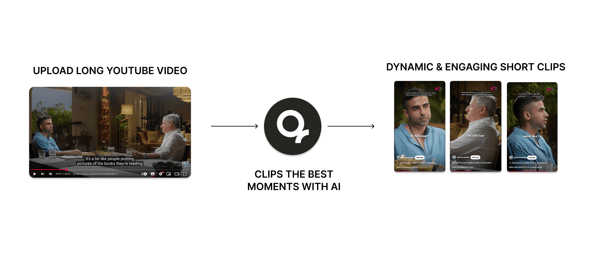
quso.ai is a creator tool that turns long videos into short, social-ready clips using AI. Since AI Clips make up over 70% of all content created on the platform, we focused on improving the screen where creators first review these generated clips.

This redesign makes it easier to explore all clips and move into editing - the step most closely tied to creator success.

How AI Clips Work?

How AI Clips Work?

How AI Clips Work?

Why Did We Decide to Redesign?

Why Did We Decide to Redesign?

Why Did We Decide to Redesign?

High Early Drop-Offs

Start a Project

42% of users dropped off after uploading their video, before engaging with the Review screen at all.

High Early Drop-Offs

Start a Project

42% of users dropped off after uploading their video, before engaging with the Review screen at all.

High Early Drop-Offs

Start a Project

42% of users dropped off after uploading their video, before engaging with the Review screen at all.

Limited Clip Exploration

Start a Project

Most users only watched the first generated clip, suggesting the layout didn’t encourage deeper exploration or comparison.

Limited Clip Exploration

Start a Project

Most users only watched the first generated clip, suggesting the layout didn’t encourage deeper exploration or comparison.

Limited Clip Exploration

Start a Project

Most users only watched the first generated clip, suggesting the layout didn’t encourage deeper exploration or comparison.

Most Users Skipped the Editor

Start a Project

Only 26% of users who reached the Review screen went on to use the Editor, despite it being the only place to finalize and polish clips.

Most Users Skipped the Editor

Start a Project

Only 26% of users who reached the Review screen went on to use the Editor, despite it being the only place to finalize and polish clips.

Most Users Skipped the Editor

Start a Project

Only 26% of users who reached the Review screen went on to use the Editor, despite it being the only place to finalize and polish clips.

Editor Usage Drove Conversions

Start a Project

Users who used the Editor converted at 9.8%, compared to just 0.77% of non-editors — showing a 12x improvement.

Editor Usage Drove Conversions

Start a Project

Users who used the Editor converted at 9.8%, compared to just 0.77% of non-editors — showing a 12x improvement.

Editor Usage Drove Conversions

Start a Project

Users who used the Editor converted at 9.8%, compared to just 0.77% of non-editors — showing a 12x improvement.

Critiquing the Old Review Screen

Critiquing the Old Review Screen

Critiquing the Old Review Screen

What We Set Out to Improve

What We Set Out to Improve

What We Set Out to Improve

Improve Discoverability

Start a Project

Improve clip discoverability so users can explore multiple clips that were generated

Improve Discoverability

Start a Project

Improve clip discoverability so users can explore multiple clips that were generated

Improve Discoverability

Start a Project

Improve clip discoverability so users can explore multiple clips that were generated

Increase Editor Engagement

Start a Project

Improve editor engagement in order to drive higher conversion by guiding more users toward the step where meaningful customization and decision-making happens.

Increase Editor Engagement

Start a Project

Improve editor engagement in order to drive higher conversion by guiding more users toward the step where meaningful customization and decision-making happens.

Increase Editor Engagement

Start a Project

Improve editor engagement in order to drive higher conversion by guiding more users toward the step where meaningful customization and decision-making happens.

Remove Distractions

Start a Project

Simplify the interface to support focused decisions by reducing distractions, clarifying the visual hierarchy, and aligning actions with user intent

Remove Distractions

Start a Project

Simplify the interface to support focused decisions by reducing distractions, clarifying the visual hierarchy, and aligning actions with user intent

Remove Distractions

Start a Project

Simplify the interface to support focused decisions by reducing distractions, clarifying the visual hierarchy, and aligning actions with user intent

Custom Clips

Start a Project

Offer fallback control by enabling users to create custom clips if they are not satisfied with the clips generated.

Custom Clips

Start a Project

Offer fallback control by enabling users to create custom clips if they are not satisfied with the clips generated.

Custom Clips

Start a Project

Offer fallback control by enabling users to create custom clips if they are not satisfied with the clips generated.

Design Process

Design Process

Design Process

With the core problems clear, we moved into the design phase and started exploring how the Review screen could work better. Our goal was to rethink the structure of the screen itself, how clips are arranged, how users move through them, and how editing fits into the flow. We began by experimenting with different layout patterns to understand which one would naturally encourage users to explore more clips and reach the Editor.

With the core problems clear, we moved into the design phase and started exploring how the Review screen could work better. Our goal was to rethink the structure of the screen itself, how clips are arranged, how users move through them, and how editing fits into the flow. We began by experimenting with different layout patterns to understand which one would naturally encourage users to explore more clips and reach the Editor.

With the core problems clear, we moved into the design phase and started exploring how the Review screen could work better. Our goal was to rethink the structure of the screen itself, how clips are arranged, how users move through them, and how editing fits into the flow. We began by experimenting with different layout patterns to understand which one would naturally encourage users to explore more clips and reach the Editor.

Horizontal Scroll

We explored a horizontal swipe-based layout, first inside a modal and later as a full-screen experience. The goal was to let users focus deeply on one clip at a time. This approach felt visually clean and modern, with fewer distractions on screen.
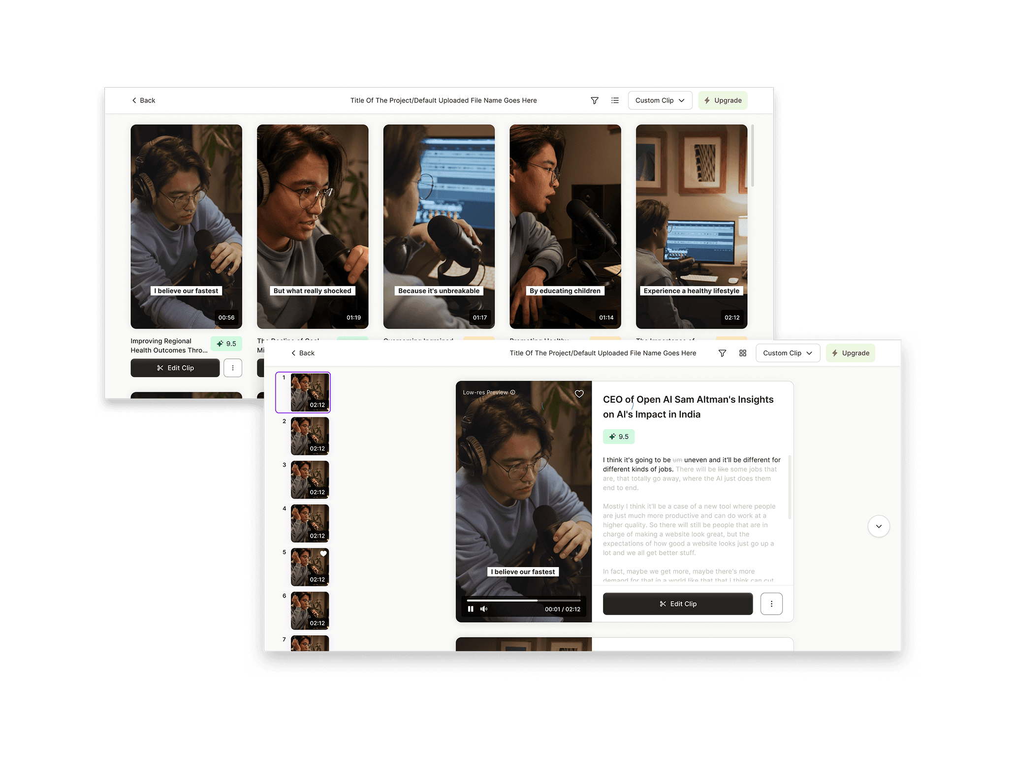
Vertical Scroll

This layout followed a familiar vertical scrolling pattern, where users review clips one at a time by scrolling down. Actions like Edit and Download were attached to each clip, keeping interactions contextual. Vertical scrolling is a well-learned behavior for video consumption.
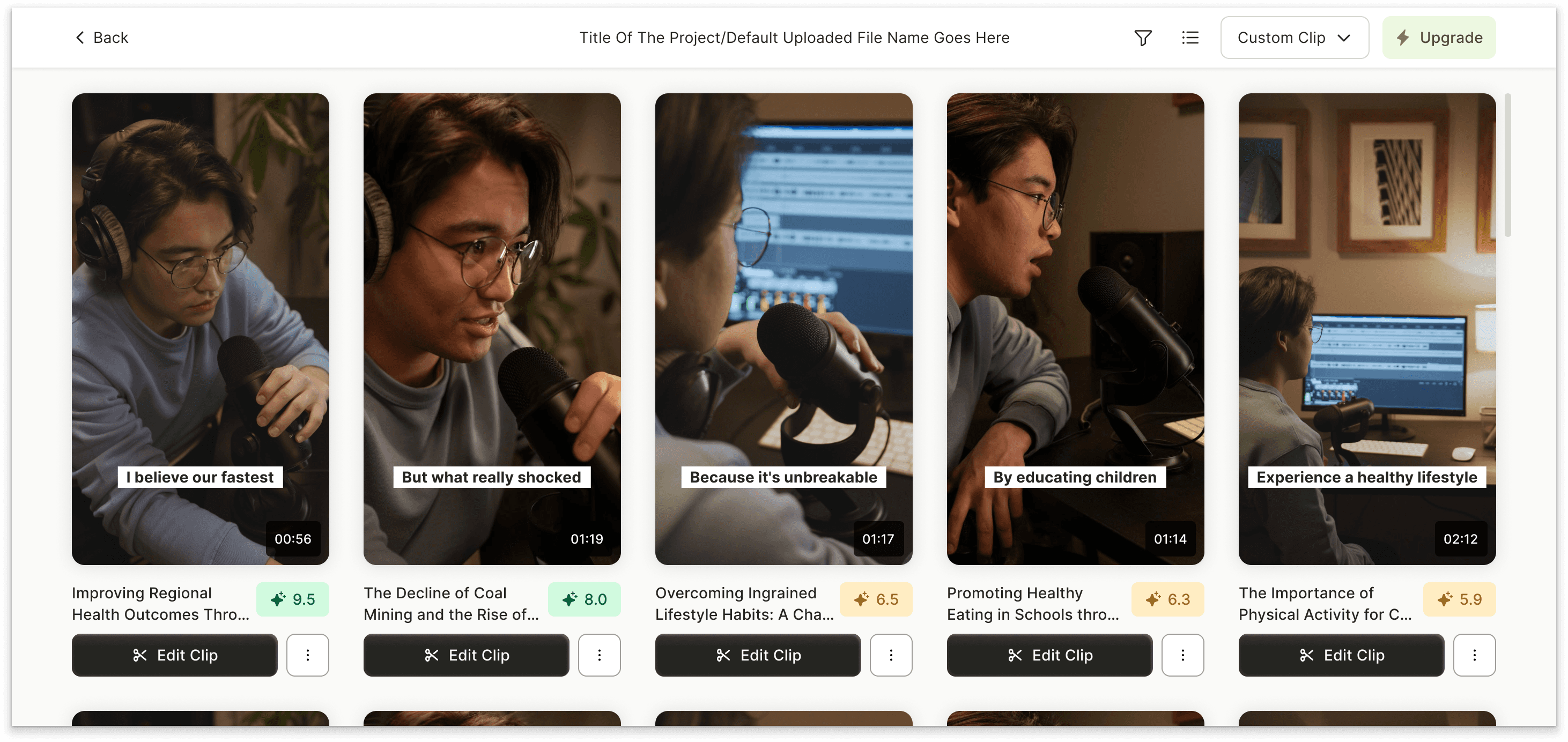
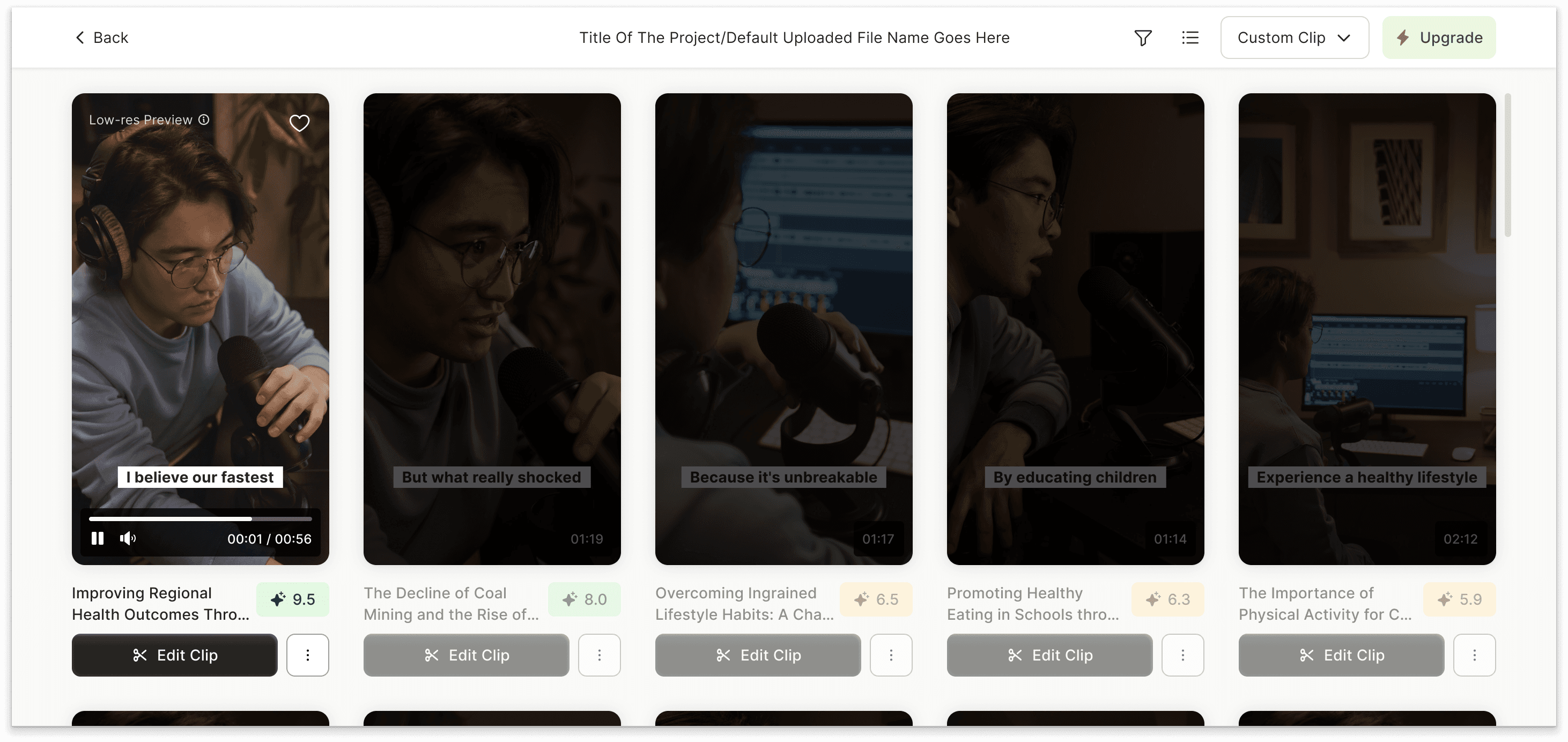
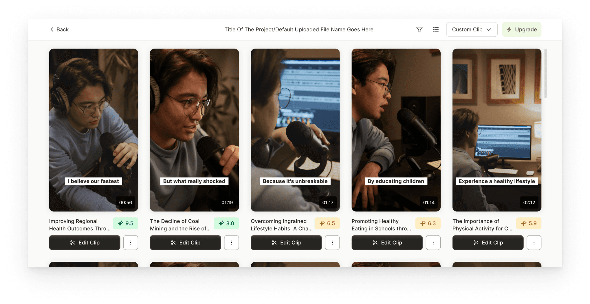
Grid View

Fast scanning for power users. Grid view displayed multiple clip previews at once, allowing users to quickly scan and compare all generated clips. This layout supported speed and control, especially for users who wanted to quickly find the best clip without watching everything.

  • HORIZONTAL SCROLL

    The modal caused performance and dev complexity, and the horizontal flow conflicted with familiar vertical video scrolling behavior.

  • VERTICAL SCROLL

    While the format felt natural, icon-only actions were not very intuitive, and exposing too many actions per clip created visual clutter. Users still tended to stop after the first clip.

  • GRID VIEW

    Grid view worked well for power users but felt dense for casual creators. Without a clear starting point, it required a stronger hierarchy to avoid overwhelming users.

Each layout solved a different part of the problem. Instead of forcing a single approach, we decided to combine the strengths:


Vertical scroll as the default, familiar experience

Grid view as an optional mode for power users


This gave users flexibility while allowing us to test which layout truly drives better engagement and editor usage.

The Final Design

The Final Design

The Final Design

For the final design, we chose a flexible approach that supports different creator workflows. Vertical scroll was set as the default since it mirrors how users naturally consume short-form videos today, making it intuitive for most creators.

At the same time, we introduced a Grid View for power users who prefer quickly scanning and comparing multiple clips. By allowing users to toggle between views, we gave them control over how they review content, while also setting ourselves up to A/B test which layout drives stronger engagement and editor usage.

Once the layout direction was finalized, we focused on improving the smaller details within each view, clarifying actions, reducing clutter, and adding subtle guidance. These refinements ensured that, regardless of layout, users clearly understood what to do next and felt encouraged to explore "Edit"

Once the layout direction was finalized, we focused on improving the smaller details within each view, clarifying actions, reducing clutter, and adding subtle guidance. These refinements ensured that, regardless of layout, users clearly understood what to do next and felt encouraged to explore "Edit"

Once the layout direction was finalized, we focused on improving the smaller details within each view, clarifying actions, reducing clutter, and adding subtle guidance. These refinements ensured that, regardless of layout, users clearly understood what to do next and felt encouraged to explore "Edit"

Toast Message

  1. Creates a positive emotional cue, rewarding users for reaching the generation step.

  2. Tells users how many clips were created, encouraging full exploration.

  3. Acts as a subtle behavioral nudge: “You have 10 clips, don’t stop at 1.”

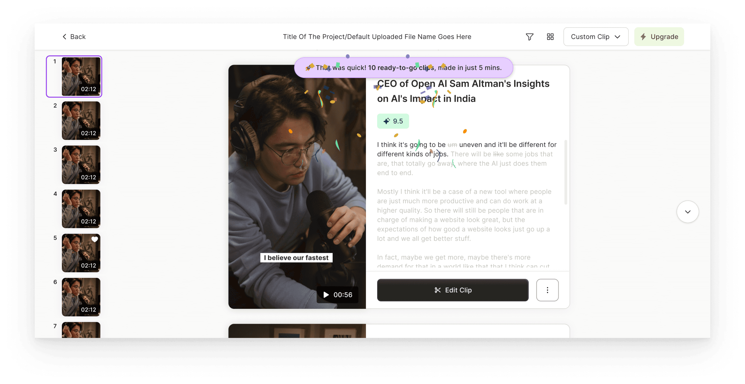
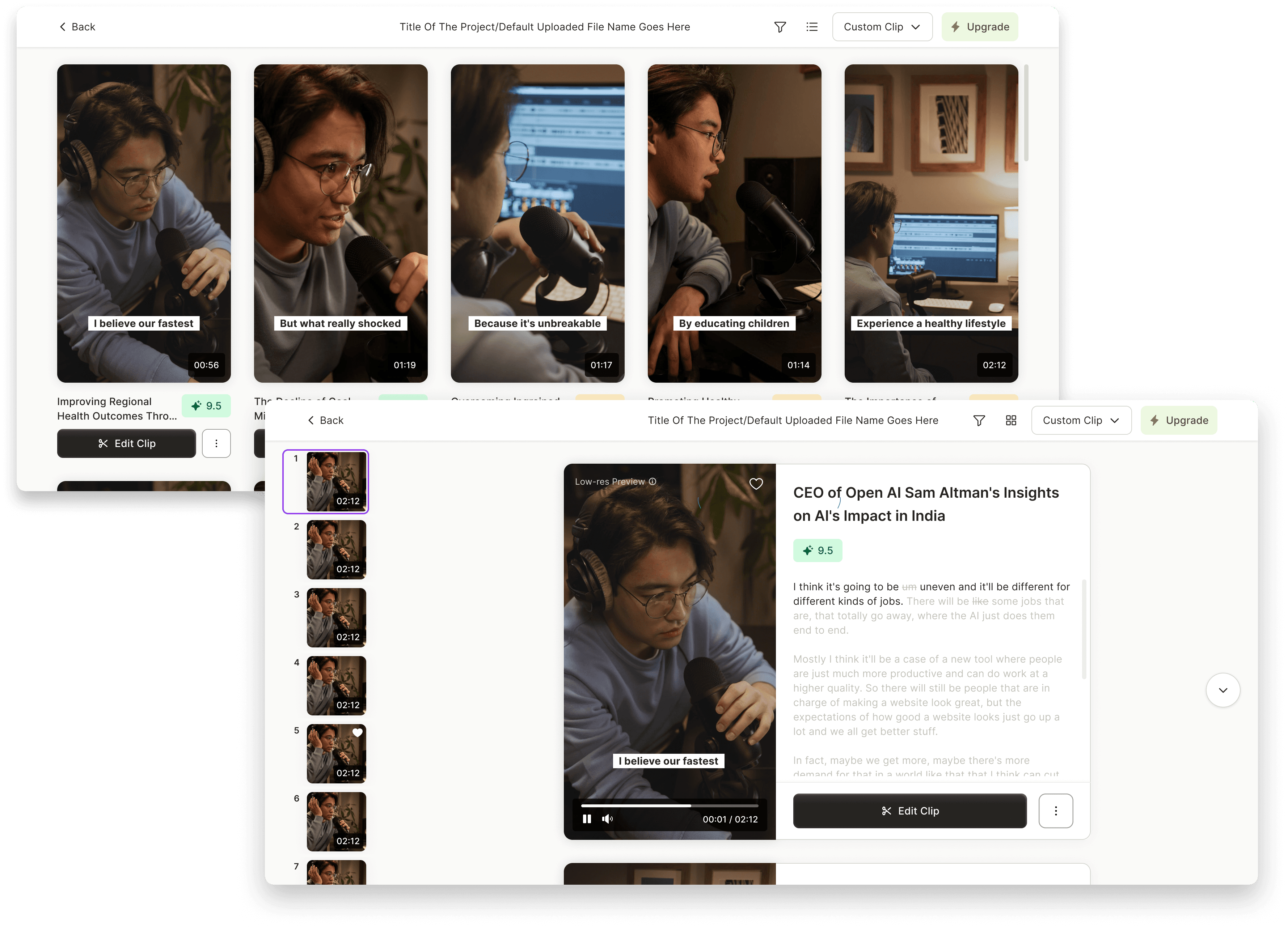
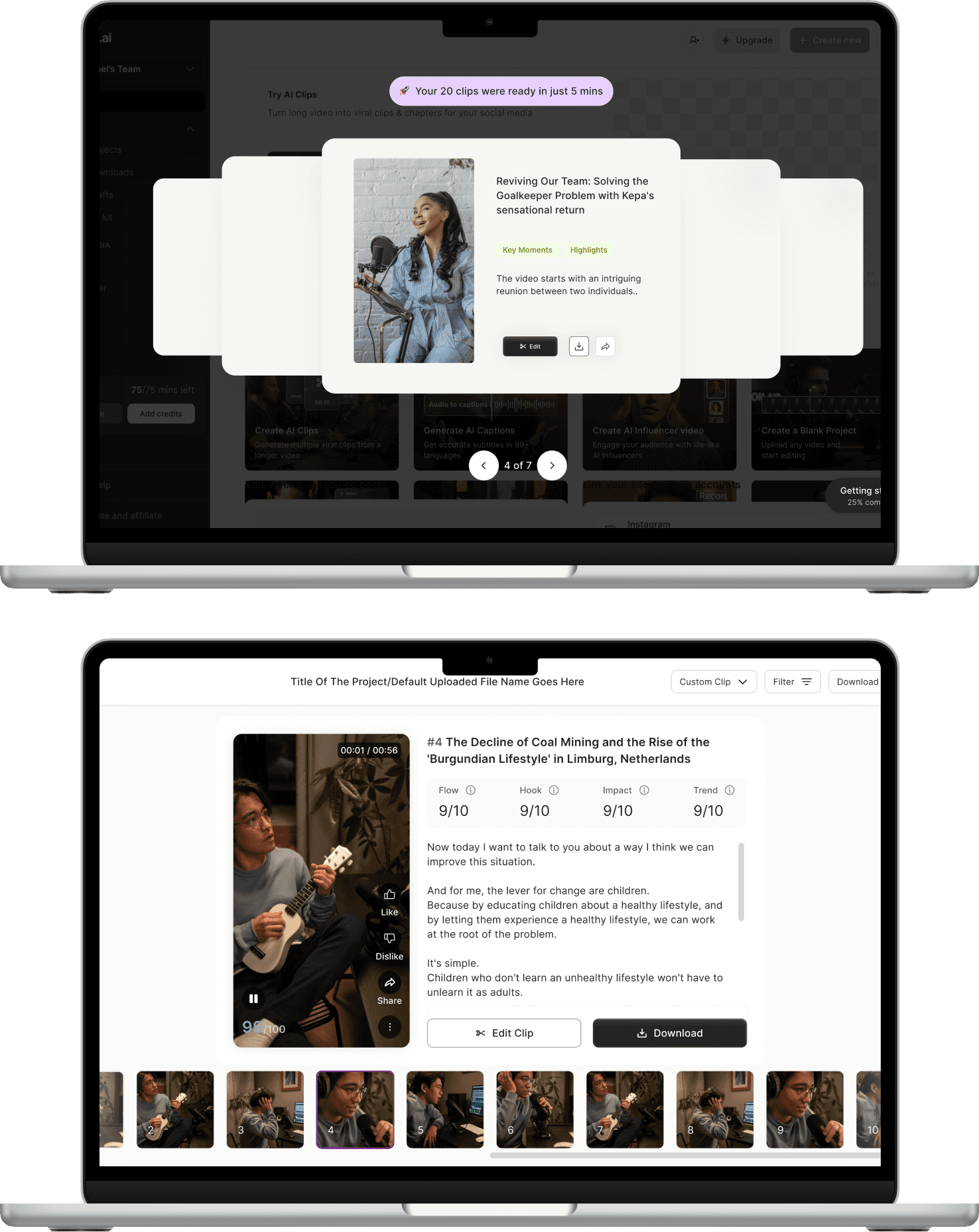
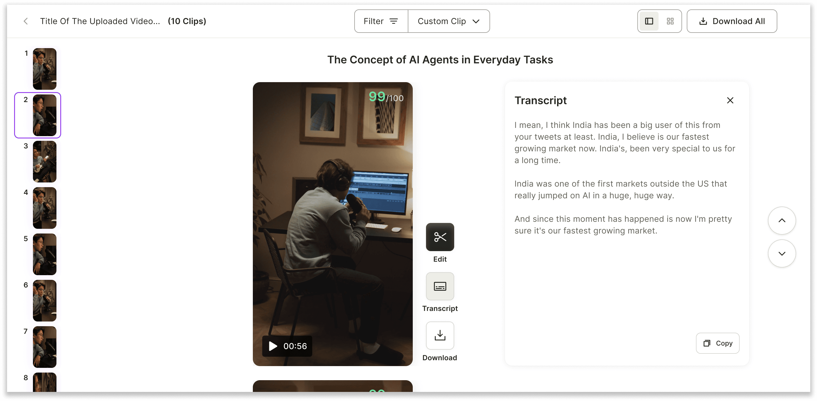
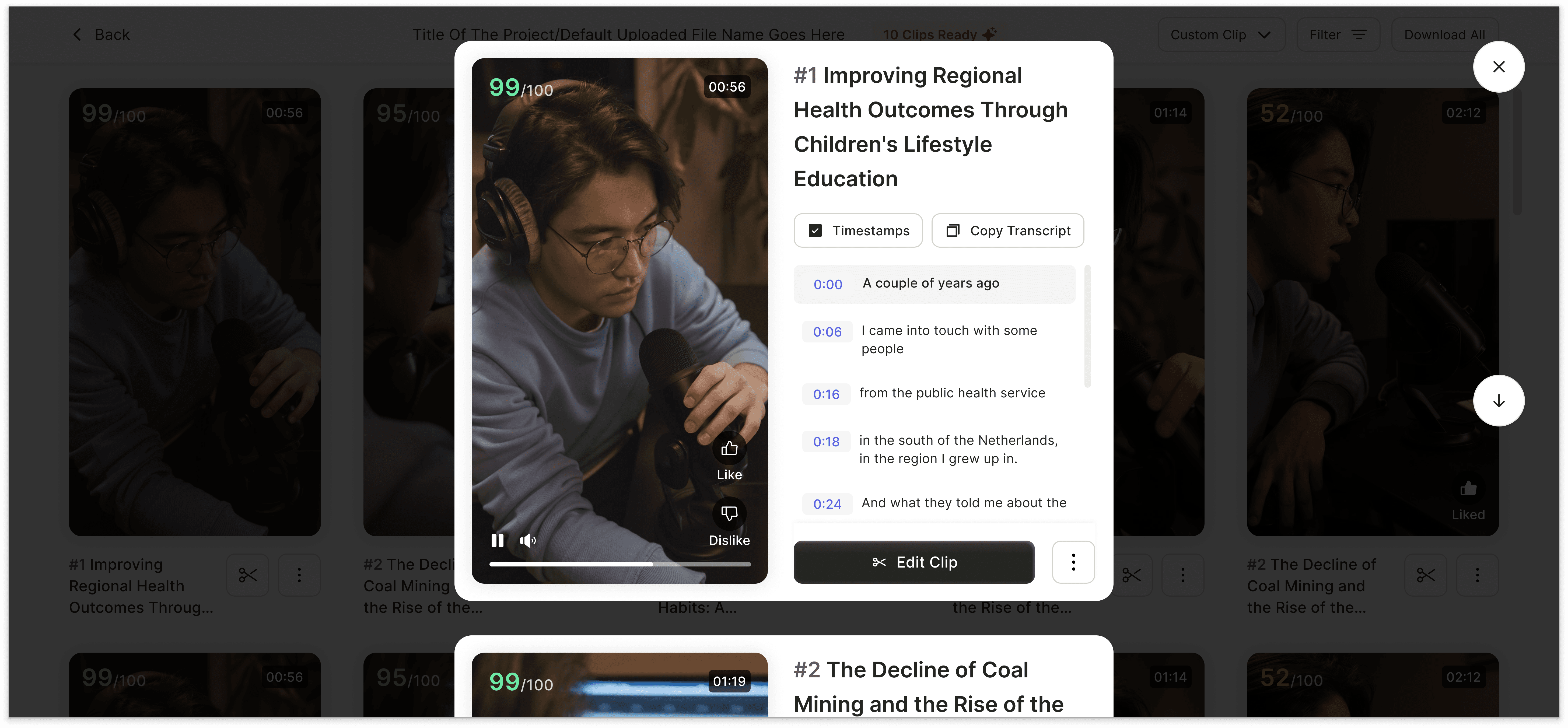
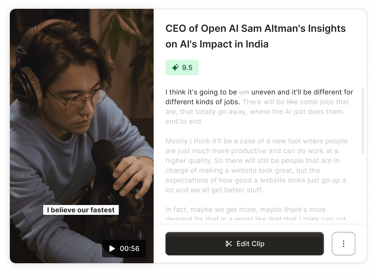
Clip Card (Vertical View)

  1. The Edit button is placed directly on the card, making the next step obvious and contextual to that specific clip.

  2. Secondary actions like Download and Transcript are now inside a three-dot menu, reducing visual noise.

  3. The transcript is now directly attached to the video, visible without a separate click, because based on the user behavior, they scan clips via the transcript.

  4. Card shows only essential info upfront, additional details appear on hover, keeping the layout clean while offering depth when needed.

Encouraging Exploration with Scroll Animation

  1. Mimics natural scroll/swipe gesture, like on YouTube Shorts or Instagram Reels, to guide discovery subtly.

  2. Triggers after 20 seconds of first clip playback if the user hasn’t scrolled, giving time to engage before nudging.

  3. Triggers again when the first clip ends, in case the user still hasn’t explored further.

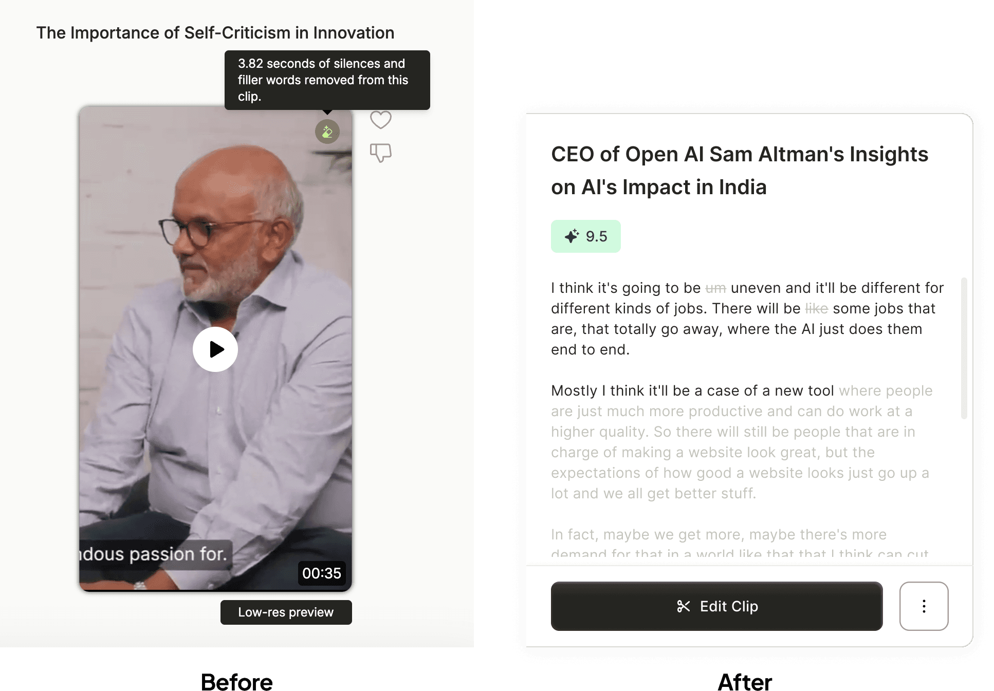
Silences & Filler Words Removal

  1. Instead of hiding changes behind an icon, we made AI edits visible inline.

  2. Removed words are shown with an asterisk, making edits transparent, scan-friendly, and easy to spot.

  3. This reduced ambiguity and gave users a sense of control and awareness.

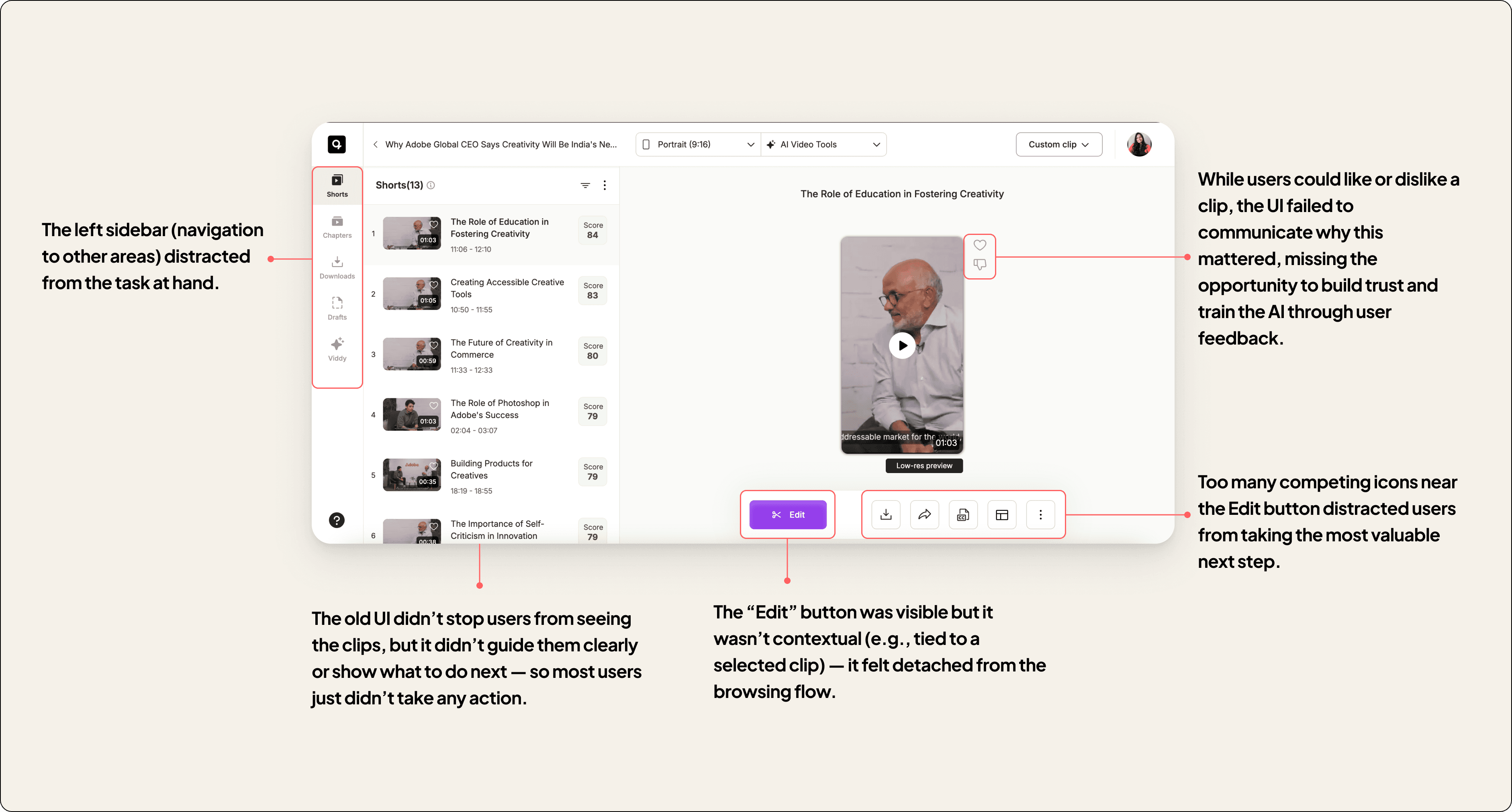
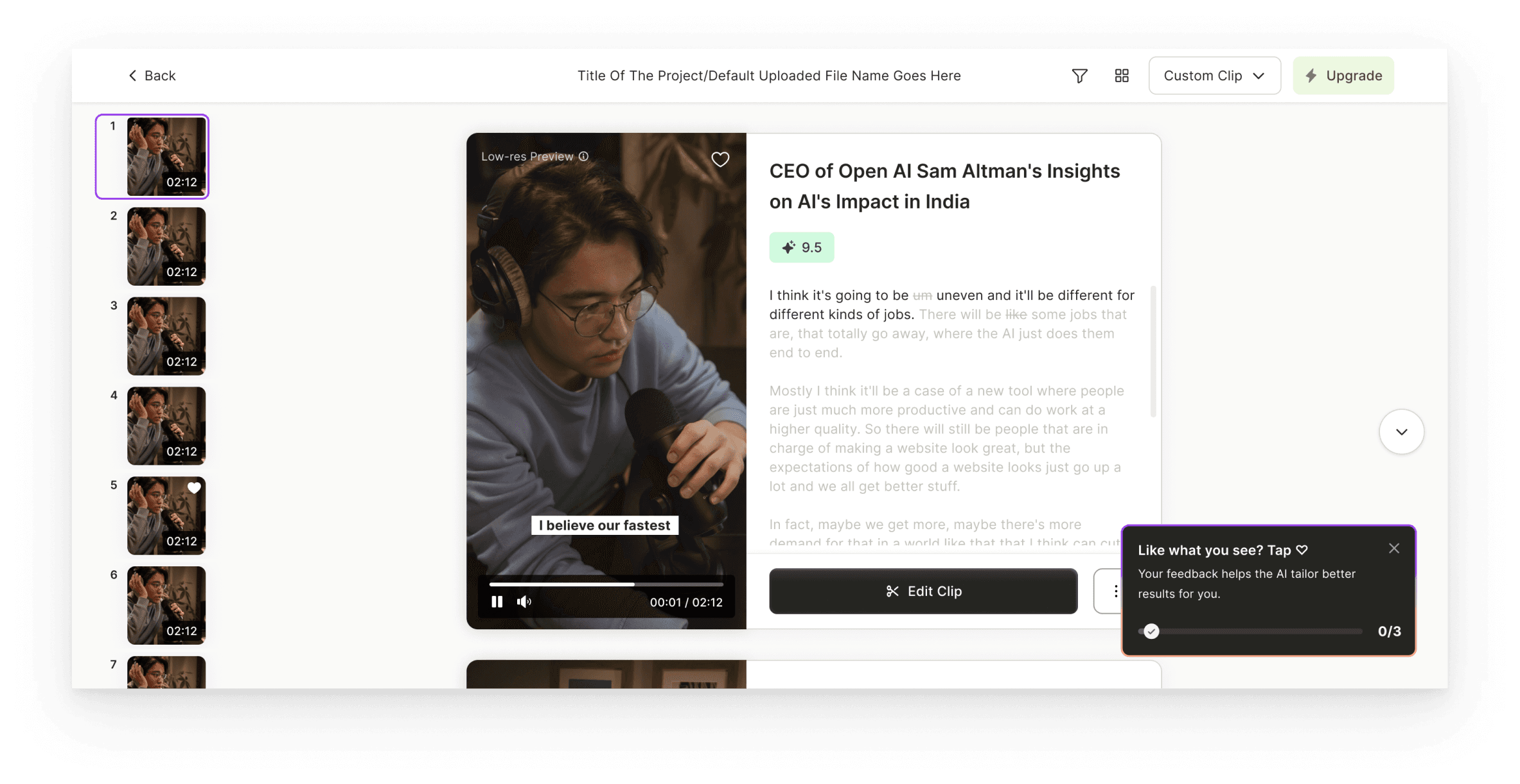
Encouraging Feedback to Make AI Smarter

  1. In the old UI, feedback buttons existed, but users had no idea why they mattered.

  2. This toast educates users that their likes help improve future results.

  3. Used just-in-time guidance without interrupting the clip review flow.

  4. Gave users a sense of contribution, creating a feedback loop between their actions and AI performance.

  5. Toast disappears after the action is completed, making it temporary, purposeful, and satisfying.

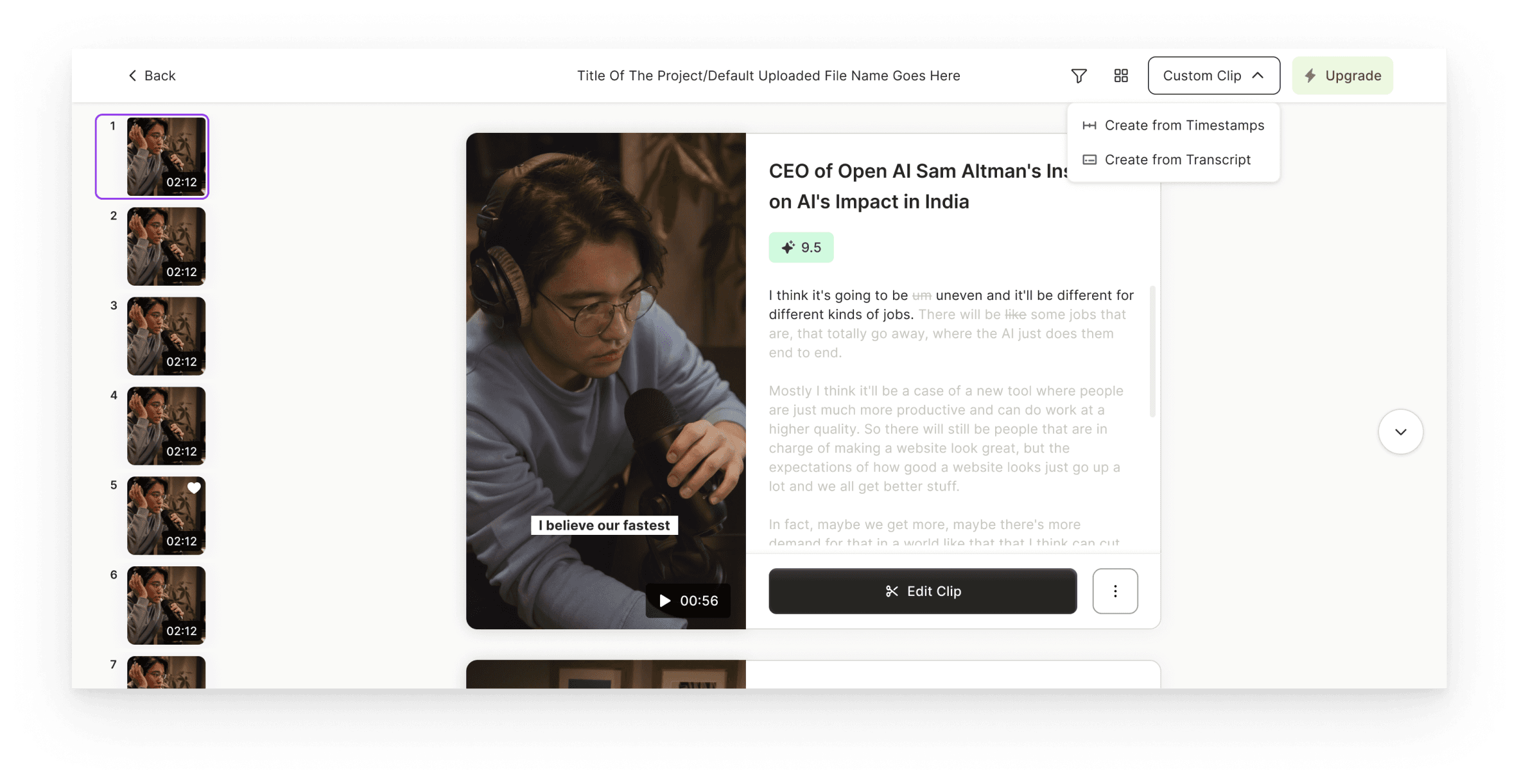
Create your own clips

  1. Positioned as a last-mile fallback, not a primary action — so it doesn’t distract from AI-first flow.

  2. Keeps users inside the same system instead of forcing them to start over elsewhere.

  3. Offers two options based on user type: visual editors (timestamps) vs. text-oriented users (transcript).

Final Grid View

The grid view will be launched as an A/B test with a layout toggle at the top:


List View: Default vertical scroll

Grid View: Optional layout for power users
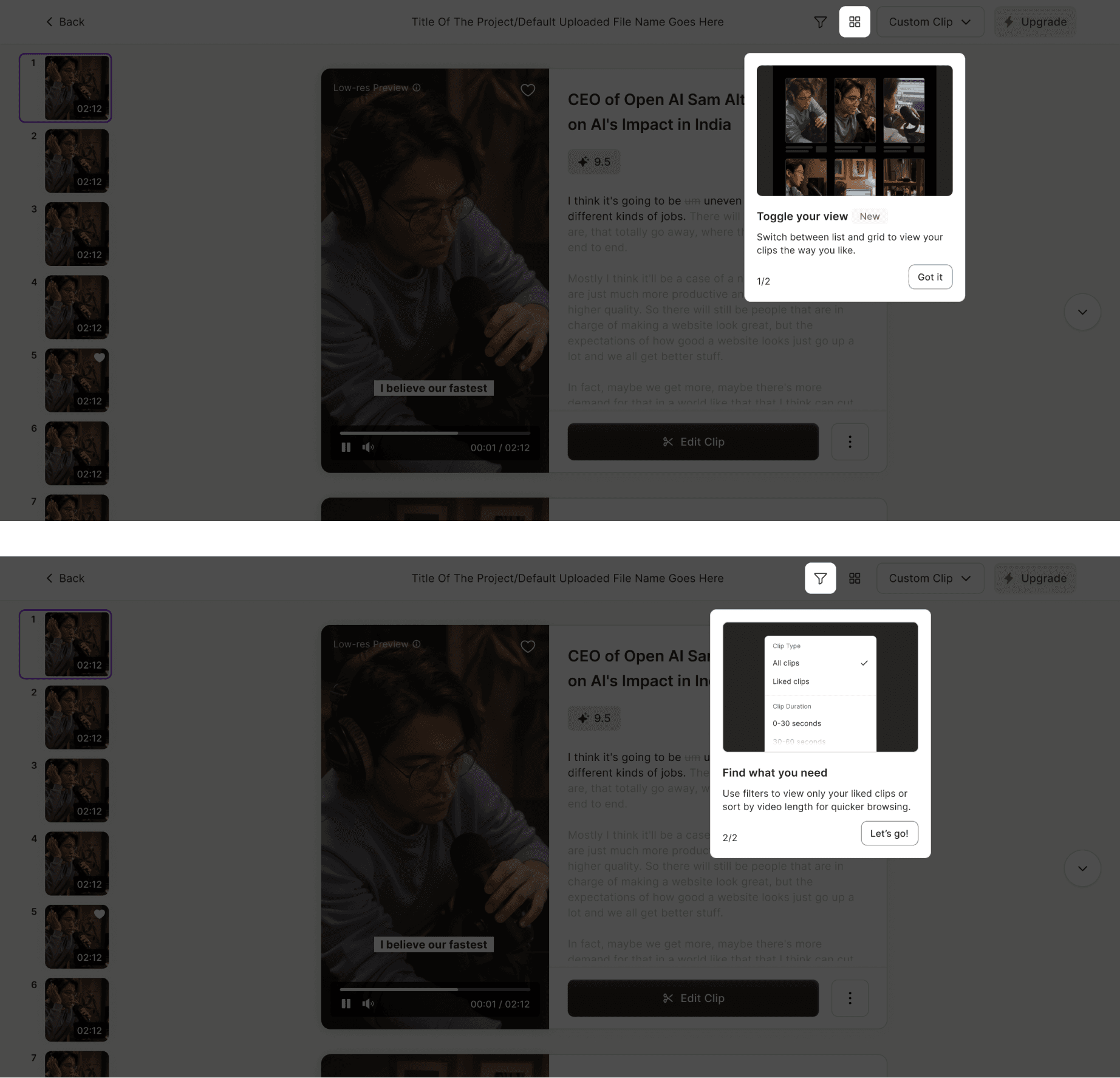
Coach Marks

We also introduced two coach marks as part of the new design to support first-time user guidance:


  1. Toggle View Coach Mark: To help users understand they can switch between List View and Grid View, we added a coach mark that highlights this toggle at the top of the screen.

  2. Filter Coach Mark: To encourage advanced use of the review clips, showing users they can filter clips by type, score, or duration.

We’ll measure success by tracking how many users enter the Editor, how deeply they explore generated clips, how often they engage with feedback, and whether these actions lead to higher export conversions.

We’ll measure success by tracking how many users enter the Editor, how deeply they explore generated clips, how often they engage with feedback, and whether these actions lead to higher export conversions.

We’ll measure success by tracking how many users enter the Editor, how deeply they explore generated clips, how often they engage with feedback, and whether these actions lead to higher export conversions.

Final Takeaways

Final Takeaways

Final Takeaways

This project reinforced how powerful data-backed design can be. By understanding where users struggled and designing for real behavior, we created an experience that better connects AI output with creator success.

This project reinforced how powerful data-backed design can be. By understanding where users struggled and designing for real behavior, we created an experience that better connects AI output with creator success.

This project reinforced how powerful data-backed design can be. By understanding where users struggled and designing for real behavior, we created an experience that better connects AI output with creator success.

What We Set Out to Do

  1. Improve Clip Discoverability: Users were watching only the first clip

  2. Boost Editor Engagement: Only 26% were reaching the Editor

  3. Provide Flexibility When AI Falls Short: Users needed fallback options

What We Did

  1. Created Guided Exploration: Stronger layout, toggles, and visual hierarchy

  2. Made Editor the Next Step: Contextual buttons and simplified actions

  3. Gave Users Control: Manual clip creation from transcript or timestamps

Growing User Base

The app quickly gained traction among individuals and businesses worldwide, with a steady increase in user adoption and engagement.

Create a free website with Framer, the website builder loved by startups, designers and agencies.