When quso.ai set out to bring its full suite of AI tools to mobile, we quickly realized shipping everything at once would slow us down and likely miss the mark. So we stripped it down to just one high-impact feature: AI Captions. This case study walks through how we turned that narrow scope into a fast, focused MVP, and how I led the end-to-end design to learn quickly, validate real behavior, and pave the way for quso.ai’s mobile roadmap.


Since quso.ai’s web platform was already live, we didn’t start from zero. I had the opportunity to interact directly with web users, ranging from individual creators to agencies managing multiple clients, and their feedback significantly shaped our mobile strategy.
Solo creators
They wanted a mobile-first solution; they shoot, edit, and post from their phones and needed a faster way to add captions.
Customization fatigue
It was real; users didn’t want endless options; they just wanted clean, good-looking captions, fast.
Mobile app demand was strong
These insights came largely from individuals who valued speed, simplicity, and workflows that worked without forcing a login.
To shape the mobile experience, I analyzed over 8+ apps across various verticals, ranging from niche caption tools like CaptCut and Veed to broader content tools like Canva and Instagram. The audit helped identify proven UX patterns, friction points, and opportunities for differentiation.
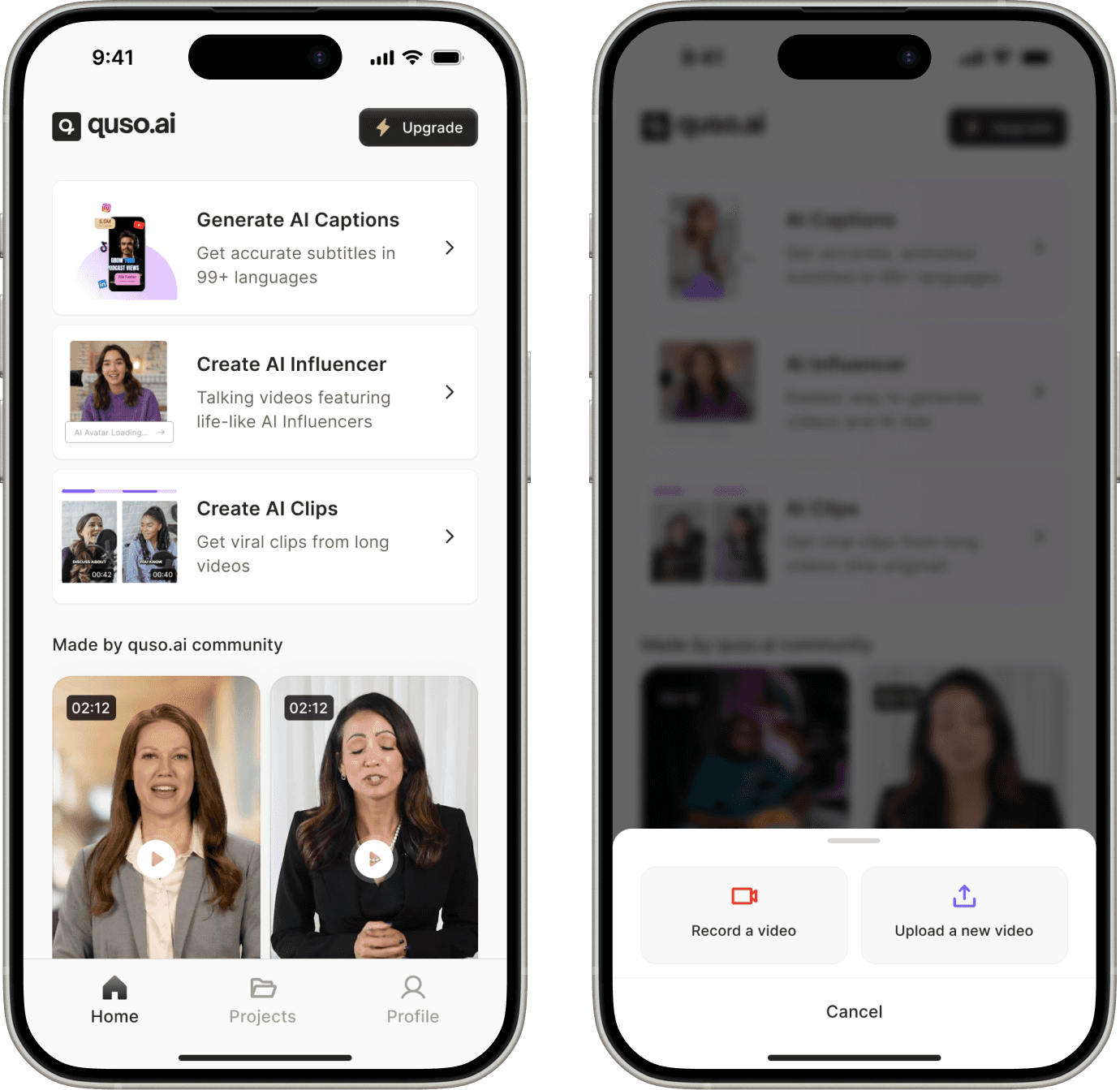
We started the design process with the Home screen because it sets the tone for the entire experience. It’s the first interaction users have with the product, so clarity and speed mattered more than feature depth at this stage. By anchoring early decisions around the Home screen, we were able to define the core action, reduce friction, and ensure the rest of the flows stayed focused on what users came to do.
Home Screen Iteration 1
We wanted a clear, action-first entry point for new users as well as existing.
The Create CTA offered users a clear starting point, along with the flexibility to kick off with UGC templates.
A bottom sheet allowed us to present all creation options without overwhelming the screen.
This pattern is familiar to users, reducing the learning curve and helping them move fast.
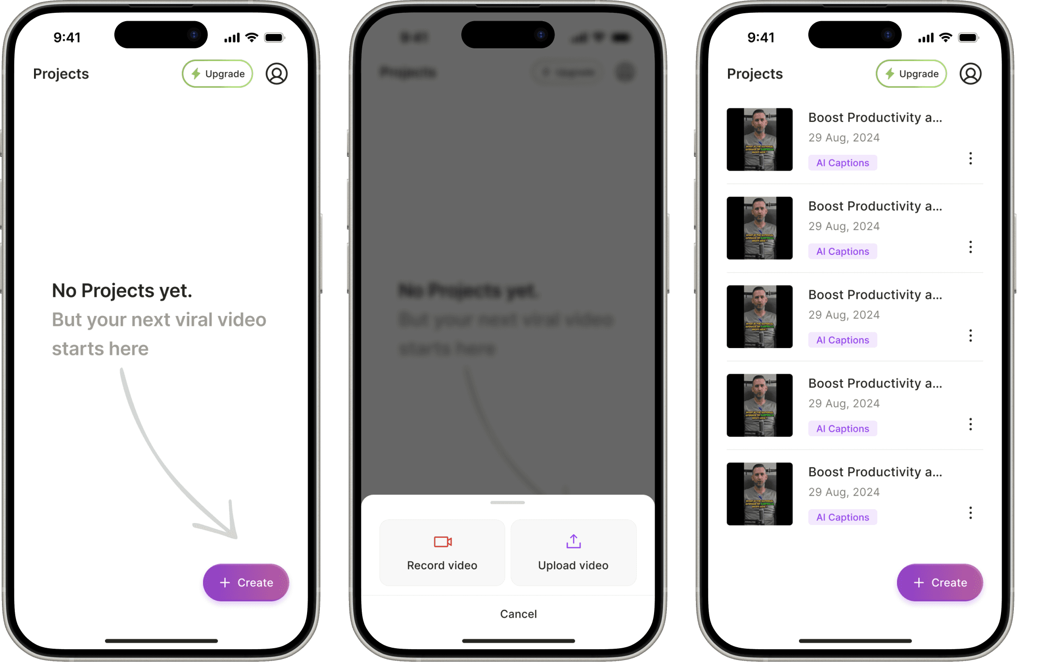
Home Screen Iteration 2
We also explored an iteration where feature cards were shown directly on the home screen, instead of being tucked behind a Create bottom sheet, to make the app’s value more immediately discoverable.
The goal across versions was to reduce the learning curve and make it easier for web users to adopt the app.
Home Screen Iteration 3
At this stage, we made two major shifts:
We decided to launch only AI Captions and not all three features
We launched the app as a separate, lowkey MVP under the name "CC Captions & Subtitles" not under the quso brand.
With this focused scope, we needed a leaner, faster home experience.
The iteration 3 approach worked because it delivered quick value with minimal friction. New users instantly understood the app’s purpose, and the interface felt intuitive without needing onboarding.
With the floating Create button as the single CTA, action happened quickly, keeping users focused and reducing cognitive load. The result was a light, fast, and purposeful experience, exactly what mobile-first creators needed.
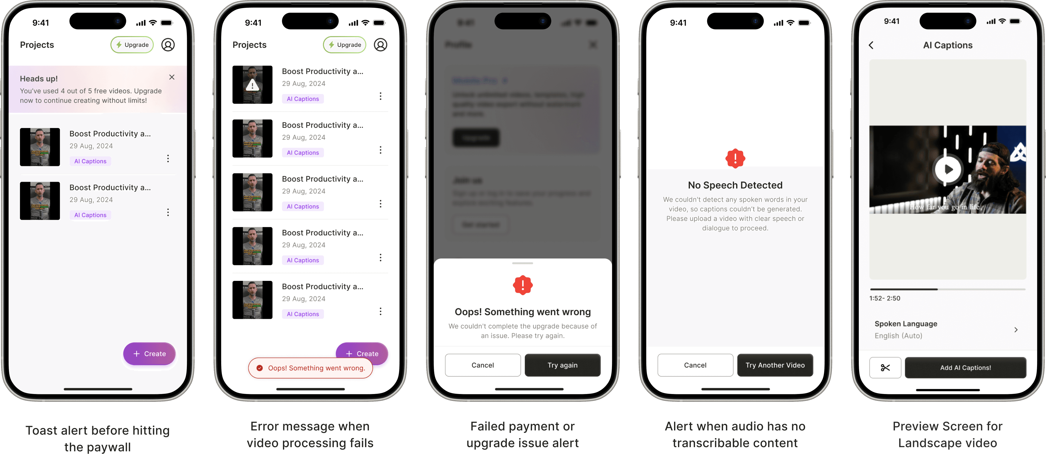
The final designs focus on clarity and ease of use. Each screen is intentionally designed to guide users from starting a video to getting usable captions, without overcomplicating the experience. Below, I walk through each screen and explain how the design supports the caption-generation process step by step.
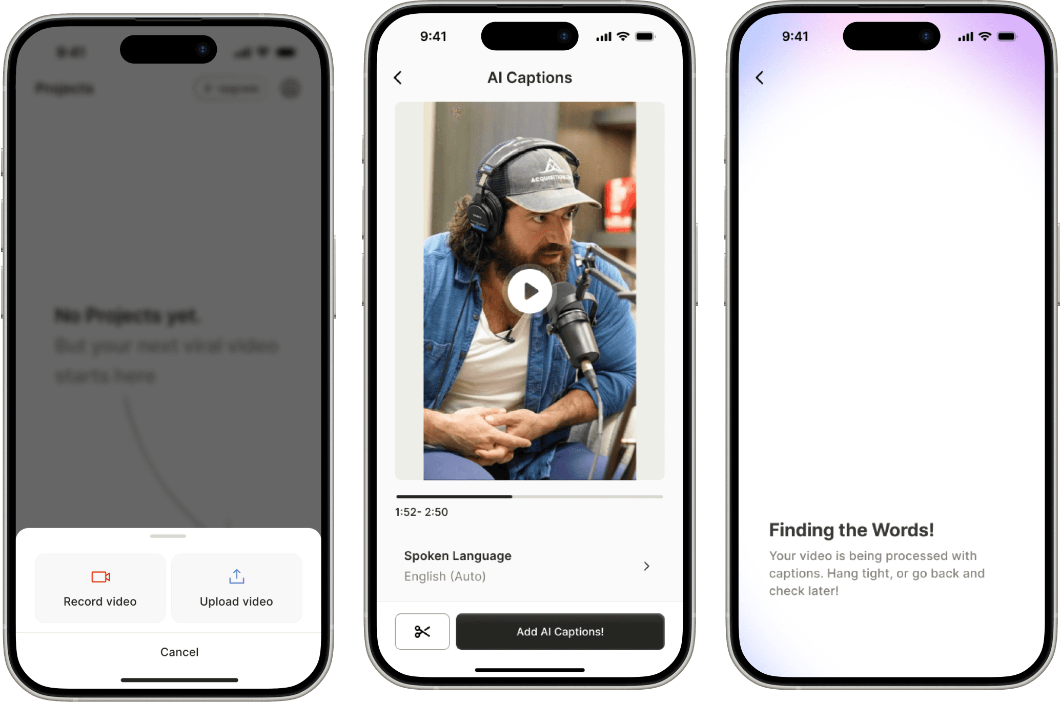
Generating AI Captions
After uploading or recording a video for which users needed captions, the experience moved into a preview stage designed for quick confirmation.
The preview screen kept controls intentionally minimal, limited to essentials like language selection and trim, so users could move ahead without unnecessary decisions.
A dedicated loading screen was introduced to handle AI processing time, which typically lasts around half the length of the uploaded video.
Clear messaging on the loader enabled users to exit and return later, reducing frustration during longer waits and making the experience feel less blocking.
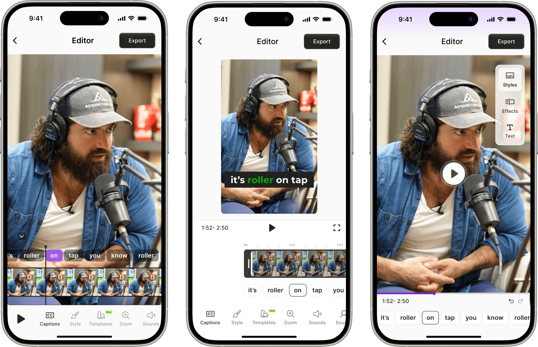
Editor
After generating captions, users landed in an editor that felt lightweight yet powerful.
Users could quickly preview & apply changes, making the editor feel responsive and creative.
It encouraged exploration without confusion, a win for mobile-first creators who want results, not learning curves.
The interface made even first-time users feel like they knew what to do, no guesswork, no clutter.
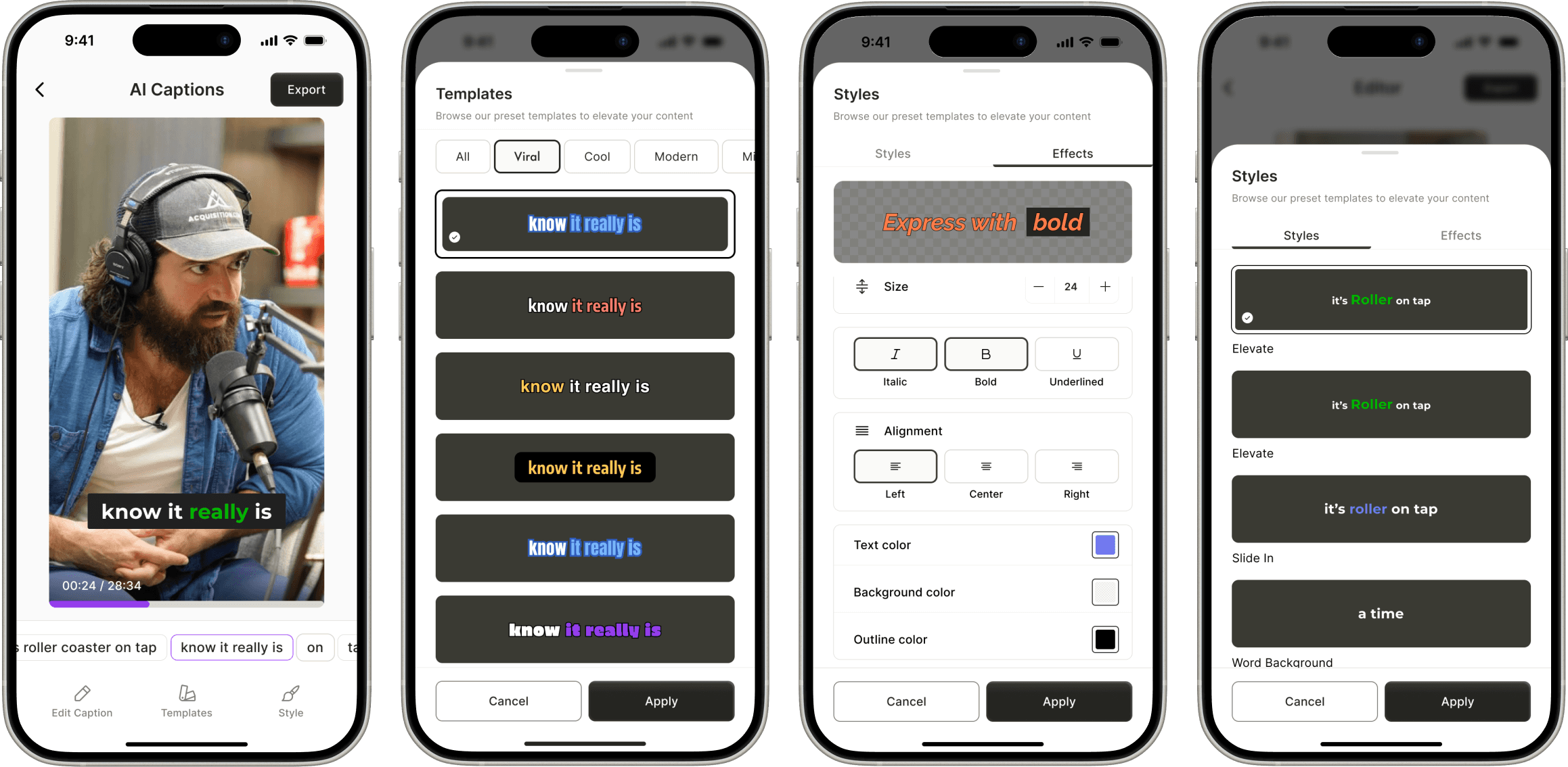
Styles - Effects Customization with Real-Time Preview
I put all the styling options like font, size, color, and effects into a full-screen bottom sheet to give users a clean, focused space to customize. Adding a preview to show changes right there made it easy to play around without distractions.
We considered using a smaller sheet so users could view the main video while editing, but that would have required more complex state management and rendering logic, syncing real-time style changes with the base video player outside the sheet. For the first version, we went with a setup that was simple, stable, and still felt easy to use.

Export
We wanted creators to instantly visualize their content in a social context, so the Reel-style preview made the outcome feel relevant and ready for sharing.
We showed the upgrade options right away, so users could make quick decisions without losing their flow.
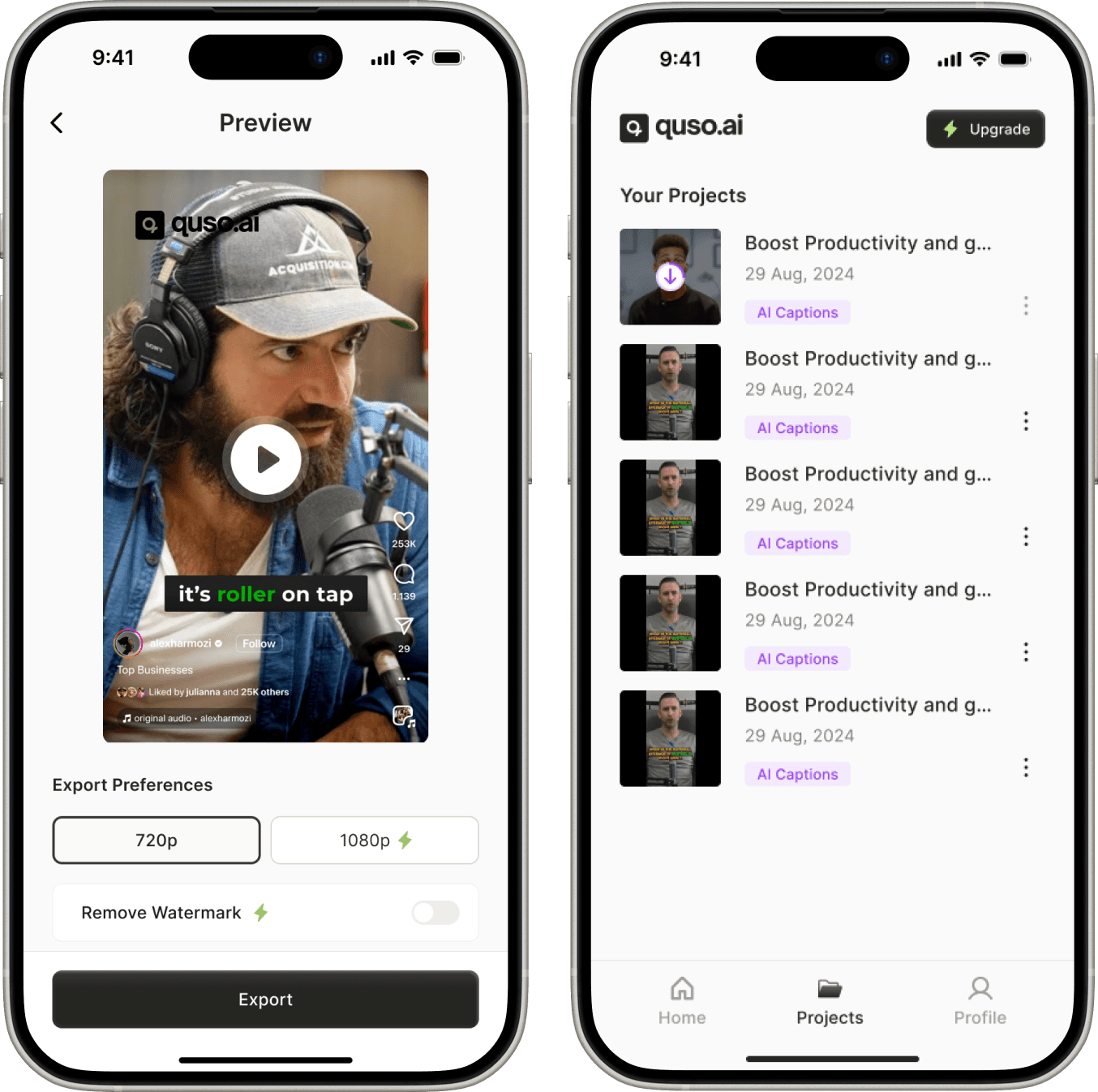
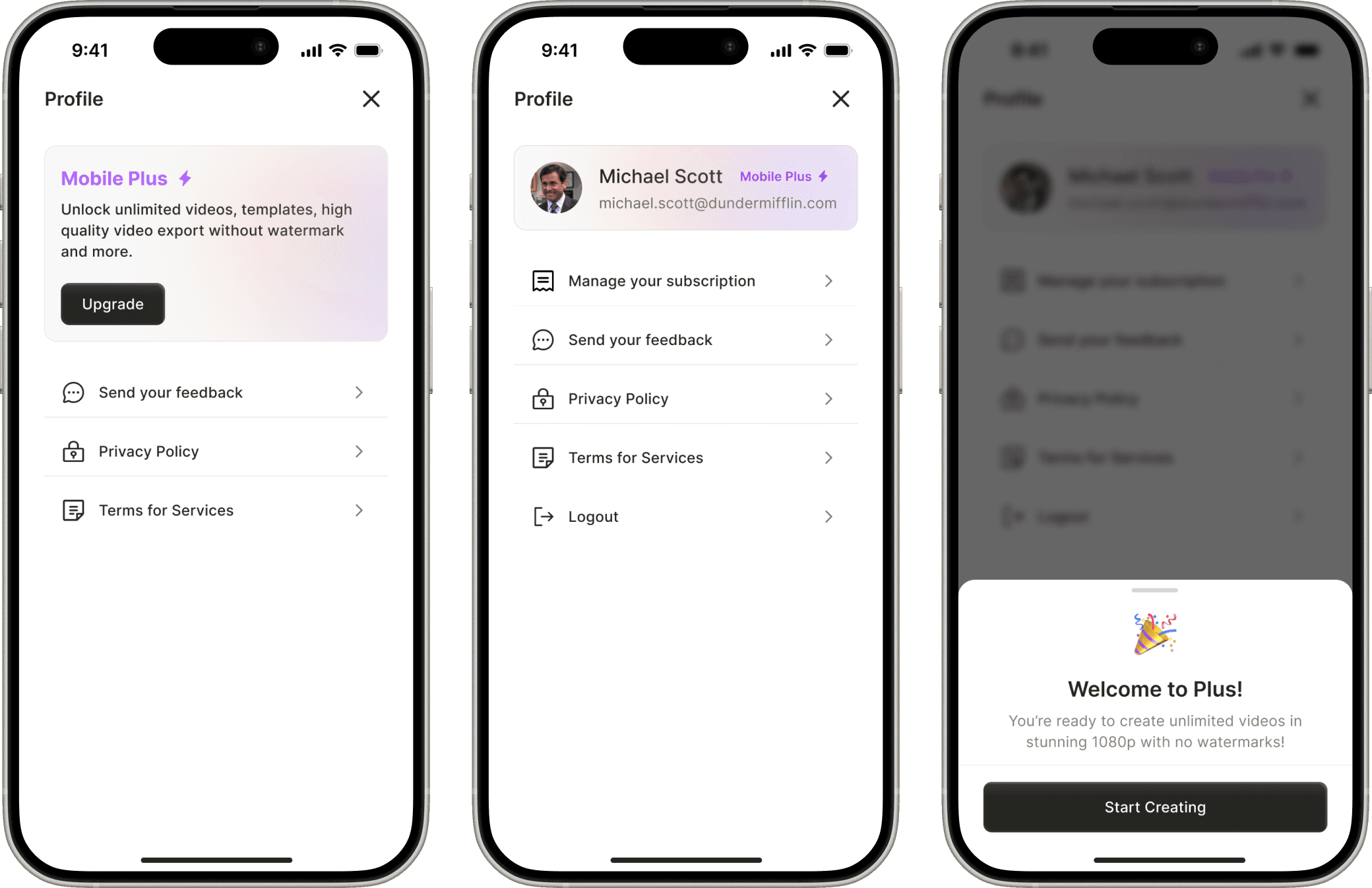
Profile
I kept the profile screen simple on purpose, focused only on what mattered: managing plans and accounts. Since login wasn’t needed for the first 5 videos, most users didn’t need to interact with it early on.
But for those who upgraded, it offered a clear, dedicated space to manage subscriptions. This helped us support a frictionless, no-login MVP while still laying the groundwork for future account-based features.
Create your own clips
Positioned as a last-mile fallback, not a primary action — so it doesn’t distract from AI-first flow.
Keeps users inside the same system instead of forcing them to start over elsewhere.
Offers two options based on user type: visual editors (timestamps) vs. text-oriented users (transcript).
Paywall A/B Test
We used Superwall to test monetization early, giving us speed, remote config, and analytics without custom dev work. Ran a 50/50 A/B test between two paywall designs.
Design 1
Simple layout with full info and both plans upfront
Design 2
Visual-led with animation and pricing shown later
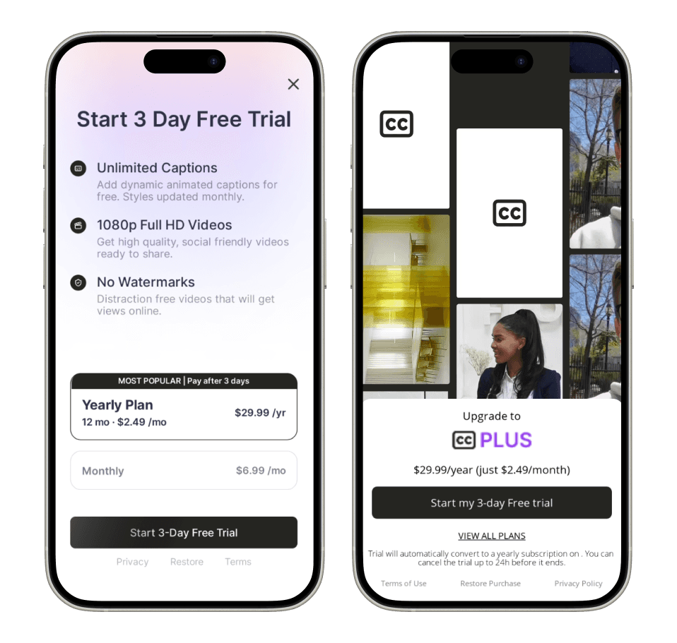
Design 1 outperformed Design 2 on both platforms:
Conversion rates:
iOS: 11.6% vs 7.4%, Android: 1.5% vs 1.1%
Clarity beats polish. Users convert better when pricing and benefits are immediately visible.
Design 3
Designed an in-house paywall (3rd design) for full visual control, but ultimately chose Superwall to move faster and learn quicker.
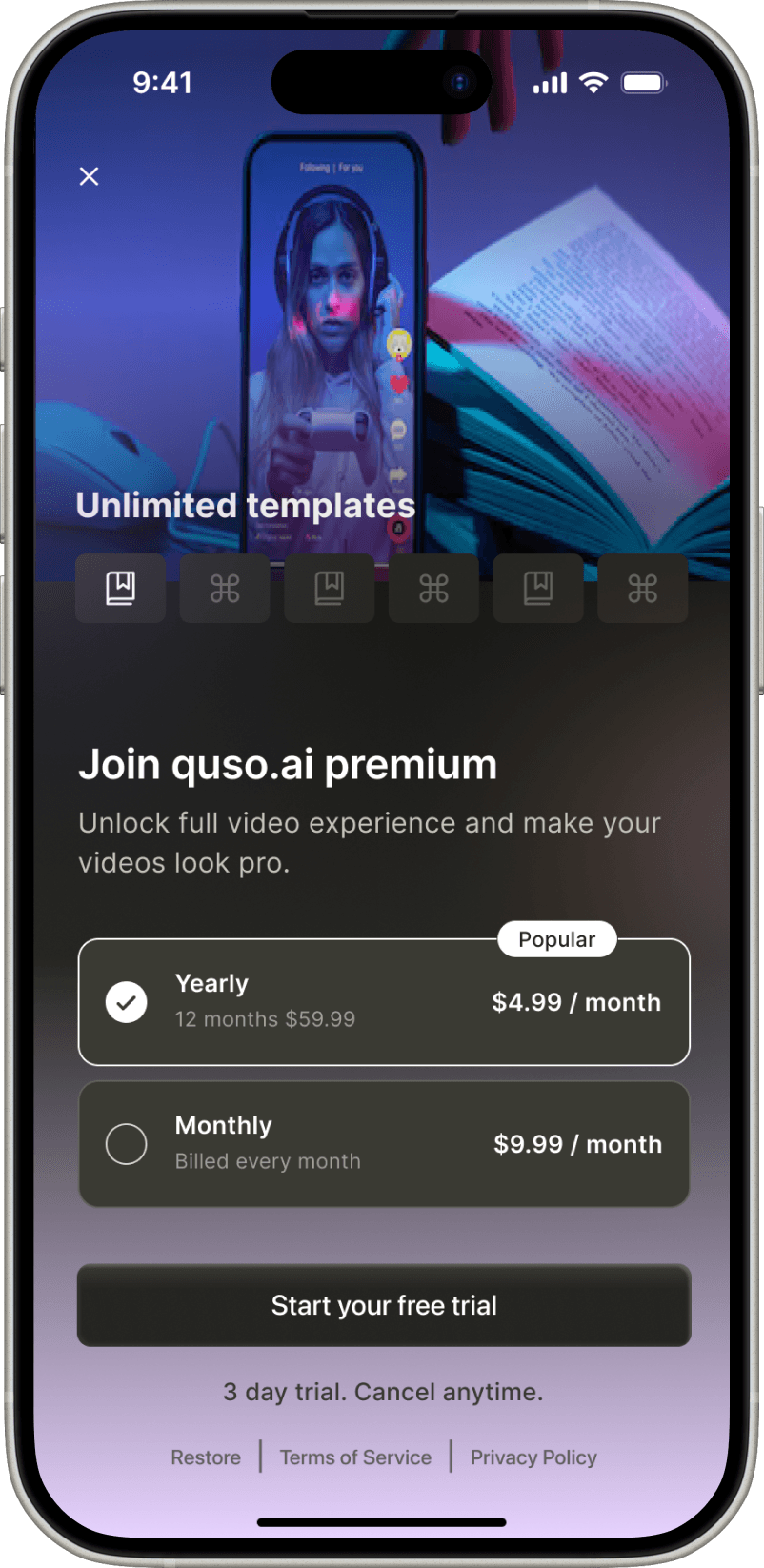
First design layered too many controls over the video. The traditional horizontal thumbnail scrubber felt unnecessary.
With a linear caption editor and short-form content, the thumbnail element didn’t provide meaningful value — it only complicated the layout.
Third design's approach appeared dynamic, but in practice, it increased cognitive load. Users now had to scan multiple areas for controls.
Launching Captions & Subtitles was a crash course in fast decision-making, scope control, and designing for speed without losing clarity.
I learned that simplicity outperforms, and that shipping a focused MVP, even under a different name, can teach you more than a full-featured launch ever could.
The learnings from this launch are now informing the next phase of quso’s mobile strategy, with deeper editing, smarter defaults, and expanded AI tools. And personally, it reminded me how valuable it is to design for progress, not perfection.